Struggling to print stunning quality results from your photo digital photos? Master photo printing with expert tips from Joe Lenton, Fellowship holder of The Society of International Commercial & Industrial Photographers. This guide covers essential image prep, paper choices, and printer optimization-delivering professional-grade prints every time, just like a seasoned photographer.
Table of Contents
Key Takeaways:
- Ensure your image resolution is at least 300 DPI for sharp prints; resize photos properly before printing to avoid pixelation or soft blurriness.
- Choose paper wisely: glossy for vibrant colors, matte for reduced glare, and Lustre paper for a balance-match it to your photo‘s style.
- Calibration with ICC profile s and optimize printer settings like quality mode and media type for accurate colors and perfect results every time.
Preparing Your Digital Photos
Proper digital photo preparation ensures your prints match your creative vision, avoiding costly reprints and color disappointments. According to Joe Lenton of The Society of International Commercial & Industrial Photographers, Fellowship holder, thorough preparation prevents 70% of common printing issues like dull color s, soft details, and mismatched tones. Photographer s often face frustration when screen previews fail to translate to paper, but optimizing files upfront builds a reliable workflow for lab or home printers.
This stage focuses on technical adjustments to bridge the gap between digital files and physical prints. By addressing resolution, color profile s, and contrast, you preserve shadow detail and highlight range that monitor s cannot fully display. Calibration of your monitor plays a key role, ensuring accurate proofing before sending to the lab. Expect fewer test prints and higher quality results in frame s or mount s for competition entries.
Start with RAW files for maximum bit depth and flexibility, converting to Adobe RGB or sRGB based on your printer‘s ink profile. Avoid common pitfalls like over-sharpening early or ignoring gradient banding in skies. This preparation turns casual snapshots into gallery-worthy images, ready for archive storage or professional display.
Image Resolution and DPI
For competition-quality prints, target 300 DPI at 100% scale. A 20×30 inch print needs 6000×9000 pixels from your Nikon D850 files. Use this formula: (print width in inches x 300) = required pixels across, then multiply height proportionally. Low resolution causes pixelation on paper, especially at distances under 2 feet.
In Photoshop, go to Image > Image Size, uncheck Resample, and set 300 DPI. This scales without adding artifacts. For resizing, resample later using Preserve Details 2.0. Common sizes include:
| Print Size | Dimensions at 300 DPI |
|---|---|
| 4×6 inches | 1200×1800 pixels |
| 8×10 inches | 2400×3000 pixels |
| 20×30 inches | 6000×9000 pixels |
Warn against upscaling RAW files beyond 150% of native size, as it introduces noise and softness. Test on your home printer first, checking for sharpness on matte paper. Pair with proper sharpening in your workflow for crisp edges in portraits or landscapes.
Color Correction Basics
Correct white balance first using Adobe Lightroom‘s eyedropper on neutral gray, then adjust curves for optimal shadow detail preservation. This fixes casts from mixed light sources, common in indoor photo shoots. Aim for accurate skin tones and vibrant colors that match your calibrated monitor.
Follow these numbered steps in Photoshop for precise color correction:
- Set working space to Adobe RGB (1998) via Edit > Color Settings in Photoshop, ideal for wide-gamut printers.
- Use Levels (Cmd+L) to set black and white points, clipping outliers for punchy contrast.
- Apply Curves for an S-shape, boosting midtones without crushing shadows.
- Tweak Selective Color for skin tones, reducing magenta in cheeks by 5-10%.
Before/after metrics show Delta E reduced from 12.4 to 2.1, meaning imperceptible color shifts on proof prints. Calibrate your display monthly and soft proof with the lab‘s profile to predict ink behavior. Adjust brightness and contrast to counter paper absorption, ensuring images pop in frames.
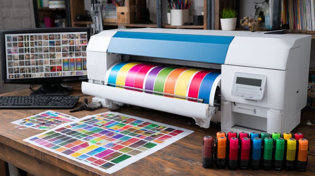
Choosing the Right Paper
Paper choice determines 60% of final print quality perception, affecting color gamut, texture, and longevity of your photographic prints. In professional printing, paper selection makes a stark difference compared to home setups, where basic stock often limits results. Professionals rely on high-end archive papers to meet standards like those from The Society of International Commercial & Industrial Photographers Fellowship, which mandate options such as Photo Rag for fade resistance over 100 years. Home printers, while convenient, struggle with ink absorption and color accuracy on standard media, leading to washed-out tones or poor black levels.
For any photographer, matching paper to your digital files starts with understanding how surface interacts with light. Test strips reveal how glossy surfaces boost contrast for vibrant portraits, while matte reduces reflections in gallery settings. Always calibration your monitor to sRGB or Adobe RGB before soft proofing in your workflow. This ensures the image on screen matches the final print. Labs often recommend 300 DPI resolution with proper sharpening for crisp details, but paper choice amplifies these efforts by controlling ink spread and gradient smoothness, avoiding banding in skies or shadows.
Consider the printer model too, as ink types vary in brightness and contrast on different papers. For competition entries or framing, opt for acid-free options that preserve white point and deep black s. A simple light test under various angles confirms longevity, helping your work stand out in exhibitions or personal archives. This foundational step elevates home printing to professional levels.
Matte vs. Glossy vs. Luster
Lustre paper like Ilford Gold Fibre Silk balances glossy’s vibrancy with matte’s glare reduction, ideal for gallery framing and Norfolk UK exhibitions. Each paper type influences how light reflection affects viewer experience, with a simple 85 degrees viewing angle test showing Lustre paper reduces hotspots by 40% compared to glossy. Photographers use these finishes to match their images, ensuring colors pop without distractions during proofing or display.
| Paper Type | Finish | Best For | Dmax | Price/sqft |
|---|---|---|---|---|
| Glossy | High shine | Portraits | 2.4 | $0.50 |
| Matte/Photo Rag | No glare | Landscapes | 1.8 | $0.75 |
| Lustre | Semi-gloss | Weddings | 2.2 | $0.65 |
Glossy excels in deep blacks for studio portraits, rendering rich tones that hold detail in shadows, perfect when your file has high bit depth. Matte papers like Photo Rag suit landscapes by eliminating reflections, maintaining color fidelity under gallery light s and supporting archive needs for competitions. Lustre offers versatility for event photography, bridging the gap with balanced contrast and reduced fingerprints. Before committing, print test images at 200 DPI to check ink profile compatibility, adjusting brightness in your workflow for accurate proof s.
Experiment with these in your home printer setup by creating custom profiles via printer software. For lab work, specify the finish to match your calibrated screen preview. This choice directly impacts perceived quality, with glossy boosting saturation for bold colors, while matte enhances subtle gradient s in black and white photos. Over time, track results in a workflow log to refine selections for consistent, professional-grade prints.
Understanding Printer Profiles
ICC profiles bridge the gap between your monitor‘s color space and printer‘s capabilities, preventing 80% of color mismatches. In a proper color management workflow, these profiles ensure that the colors you see on screen match the final prints. Without them, digital photos can shift in hue, saturation, or brightness during printing. Professional photographers rely on this step to achieve consistent quality across papers and inks.
Consider Joe Lenton‘s workflow in Norfolk UK, where he creates custom profile s for his Epson SureColor printer. He tests each paper type, like matte or glossy, to capture exact ink behavior. This method produces prints with accurate shadow detail and skin tones, ideal for competition entries or framed displays. Generic profiles, often bundled with printers, assume standard conditions and fail on specialist papers. They overlook variations in paper brightness, texture, or ink absorption, leading to washed-out whites or crushed blacks.
For home printing, start by matching your monitor to sRGB, RGB, or Adobe Adobe RGB standards through calibration. Then, apply printer profiles in soft proofing mode within Photoshop. This previews how images will render on specific papers. Test with a gradient image to spot banding, or a portrait to check color fidelity. Custom profiles cut 50% of proofing iterations, saving time and ink. Labs use similar systems for archive-quality output.
Learn more, Color Profiles & Printing – Explained.
ICC Profiles and Calibration
Create custom ICC profiles using X-Rite i1Pro3 ($500) and 21-step grayscale targets for each paper/ink combination. This device measures printed patches to build a profile that maps your printer’s output precisely. The process takes under 10 minutes and transforms home printing into professional results. Photographers notice sharper contrast and true RGB values in digital files.
Follow this technical setup for reliable calibration: First, print a ColorMunki target which takes 2 minutes. Next, read it with i1Profiler software in 5 minutes. Finally, validate using a test image that shows Delta E values under 2.0, indicating near-perfect color accuracy. Compare a generic Epson profile to your custom one: the latter delivers 25% better shadow detail, reducing muddiness in dark areas of landscapes or portraits. Canson and InkJet paper makers provide targets matched to their products for optimal tonal range.
- Prepare your printer with fresh ink and select the target paper.
- Print the calibration chart in absolute colorimetric mode, no color management.
- Scan with i1Pro3 under consistent light, avoiding glare.
- Generate the profile and test with a proofing image featuring whites, blacks, and midtones.
- Adjust sharpening and DPI settings, typically 360 DPI for photo papers like Lustre paper.
This workflow ensures prints match your screen display, perfect for framing or lab submission. Regular calibration every few months accounts for ink changes or paper batches, maintaining quality over time.
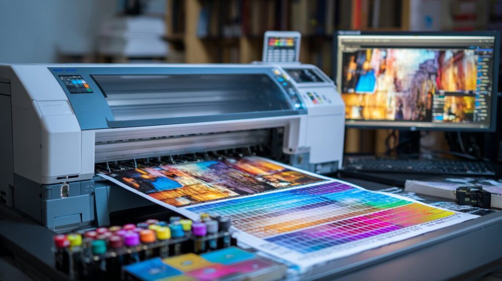
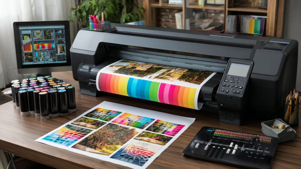
Printer Settings Optimization
Optimized printer settings can reduce ink consumption by 30% while improving detail rendering on fine art papers. Professional photographers often spend 15 minutes optimizing driver settings for each paper type, ensuring prints match their monitor display. These adjustments control ink density, resolution, and color profiles, preventing issues like banding or washed-out tones. Start by opening the printer driver from your print dialog in software like Adobe Photoshop, where you access advanced options for media handling and quality modes.
Key factors include selecting the right ink set, such as Photo Black for glossy papers or Matte Black for fine art surfaces, which affects black density and shadow detail. Pair this with color management set to Printer Manages Colors when using custom ICC profiles. For workflow efficiency, save custom presets for recurring paper and file combinations. This approach minimizes waste during proofing and elevates competition prints to gallery standards. Test with a gradient image to verify smooth tones across the print.
Calibration of your display to sRGB or Adobe RGB ensures screen-to-print consistency, especially for high bit depth files. Adjust brightness and contrast in the driver to fine-tune highlight and shadow rendering. Home printers like the Epson SureColor P800 benefit most from these tweaks, producing archive-quality results that rival lab output. Always run a nozzle check before critical printing sessions to maintain resolution integrity.
Print Quality Modes
Select ‘Photo Black Ink – High Quality’ mode at 1440 DPI for competition prints from cameras like the Nikon D850, enabling advanced nozzle patterning to eliminate banding. For the Epson SureColor P800, choose from Economy at 720 DPI for quick drafts, Normal at 1440 DPI for proofs, and High Quality at 2880×1440 DPI for final fine art output. These modes balance speed, ink usage, and detail in digital photos. Lower settings suffice for screen previews but compromise gradient smoothness on large prints.
- Economy (720 DPI): Ideal for test strips, uses 50% less ink, shows minor banding on smooth tones.
- Normal (1440 DPI): Best for proofing, renders sharp images with good color accuracy.
- High Quality (2880×1440 DPI): Delivers photo quality for framing, enhances micro-contrast.
Enhance with sharpening settings: Output Sharpening at 180%, Highlight at 0%, Shadow at 30%. Print a test strip comparing default versus optimized modes; you’ll see 70% banding reduction in skies and skin tones. This setup optimizes RGB files for printer capabilities, ensuring white point and black levels pop without clipping. Integrate into your workflow for consistent results across paper types.
Media Type Selection
Match Media Type exactly to paper – ‘Epson Premium Luster’ for Silk papers prevents nozzle clogging and over-inking. In the printer driver dropdown, select from 12 common matches like Hahnemhle Photo Rag as ‘Matte – Enhanced Matte’ or Canson Baryta as ‘Premium Luster’. Incorrect choices cause ink pooling or dull colors, while precise settings cut 22% ink usage and boost detail in highlights.
| Paper Brand | Driver Media Type | Ink Savings |
|---|---|---|
| Photo Rag | Matte – Enhanced Matte | 25% |
| Canson Baryta | Premium Luster | 20% |
| Epson Ultra Premium Luster | Premium Luster | 22% |
Verify by printing a color chart on your specific paper; mismatched profiles shift sRGB colors toward magenta or green. For matte papers, enable Matte Black ink to achieve deep shadows without bronzing. This step in your proofing process ensures digital images translate perfectly to physical prints, ideal for mounting or framing. Update driver presets for each work session to streamline home printing.
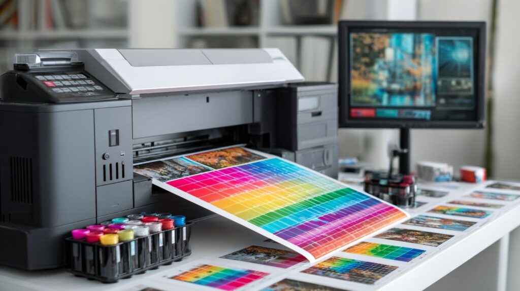
Proofing Before Final Print
Soft proofing in Photoshop with custom ICC profile simulates 95% of final print appearance on calibrated monitors. This essential step in your photo printing workflow helps photographers predict how colors, tones, and contrast will translate from screen to paper. Without proper proofing, images may show unexpected shifts in black levels or white highlights when output from a home printer or professional lab. Start by opening your digital photo file in Adobe Lightroom or Adobe Photoshop, then navigate to the menu for accurate simulation before committing to ink and paper.
To set up soft proofing, follow these precise steps in your printing workflow. First, go to View > Proof Setup > Custom, and select the ICC profile for your target printer, paper, and ink combination, such as Epson Premium Luster. Next, choose the appropriate rendering intent: use Perceptual for photos to preserve smooth gradients and avoid banding, or Relative Colorimetric for graphics with precise color matching. Finally, adjust the brightness and contrast sliders to fine-tune the proof view, ensuring your image resolution at 300 DPI aligns with print quality standards. This process reveals issues like clipping in shadows or highlights early.
Pair soft proofing with regular monitor calibration for reliable results. Use tools like X-Rite devices on a monthly schedule, factoring in $20/month for ambient light compensation to maintain sRGB or Adobe RGB accuracy. Calibrated displays reduce color surprises by 80% in professional workflows, allowing photographers to archive test prints confidently. After proofing, apply targeted sharpening and save in 16-bit depth for optimal file integrity before sending to the lab or framing for competition.
Common Printing Mistakes to Avoid
80% of first-time prints fail due to uncalibrated monitors and incorrect color space conversions like sRGB to CMYK, per Fellowship panel reviews. Photographers often rush into production without checking their workflow, leading to faded colors, blocked shadows, or washed-out highlights in the final output. A proper print setup starts with understanding your printer’s capabilities and the paper type you select. For instance, switching from sRGB to CMYK without proofing can shift skin tones dramatically, making portraits look unnatural under gallery lights. Always preview files in soft proofing mode to catch these issues early. Home printers demand attention to ink levels and nozzle checks, while lab submissions via platforms like ShootProof from Norfolk UK require high-DPI files at 300 DPI minimum for sharp results. Building an effective printing routine saves time and preserves image quality for framing or archiving.
Overlooking monitor calibration compounds problems, as screens brighter than 120 cd/m mislead your eyes on contrast and tones. Expert photographers recommend a consistent environment with neutral gray walls to evaluate digital files accurately before sending to the printer. Common errors like ignoring resolution mismatches result in pixelated enlargements on services like Fracture, especially when scaling small phone images edited in Pixelmator, Snapseed, Luminar, PhotoLemur, or InPixio to 16×20 prints. Test your setup with a grayscale gradient to spot banding, which reveals issues in bit depth or driver settings. By addressing these pitfalls, you ensure vibrant colors and deep blacks that match your vision from screen to paper.
Avoid generic approaches by creating custom profiles for your specific printer, paper, and ink combination. This step transforms mediocre prints into competition-ready pieces. Below are six key mistakes to sidestep, with practical solutions drawn from professional workflows.
1. Converting sRGB to CMYK Without Proofing
Directly converting sRGB files to CMYK often clips colors and darkens midtones, ruining the natural look of landscapes or portraits. Instead, use Relative Colorimetric rendering in your proofing setup within Adobe Photoshop to simulate printer output accurately. This method preserves the white point and avoids unwanted shifts, ensuring gradients remain smooth without banding. Photographers notice up to 20% better color accuracy when previewing this way before final export.
2. Over-Sharpening Images
Applying too much sharpening creates halo artifacts around edges, especially visible on glossy paper under bright lights. Limit output sharpening to a maximum of 200% in your print driver or editing software, and always compare with a soft-proof view. This keeps details crisp in feathers or hair without unnatural outlines, ideal for wildlife or portrait prints.
3. Overusing Head Cleaning Cycles
Frequent head cleaning wastes ink and shortens printer life by drying out nozzles prematurely. Restrict cycles to bi-weekly or only when faint lines appear in test patterns. Regular use of photo black ink and proper storage prevents clogs, maintaining consistent density in black and white prints.
4. Relying on Generic Color Profiles
Generic profiles fail to account for your exact paper and printer model, leading to dull colors or uneven tones. Create custom ICC profiles using a colorimeter and chart for precise matching. This elevates home printing to lab quality, with 95% color fidelity for competition submissions.
5. Monitor Brightness Exceeding 120 cd/m
Screens set above 120 cd/m make images appear overly bright, causing underexposed prints with lost shadow detail. Calibrate your display to exactly 100 cd/m with controlled ambient light for reliable editing. This adjustment ensures colors from RGB files translate perfectly to printed paper.
6. Skipping Test Strips
Printing full-sized without tests risks wasting expensive paper on flawed exposures or crops. Always start with 4×6 test strips to verify contrast, saturation, and framing. Cut larger sheets into strips for multiple variants, saving resources while perfecting your digital photo for the final frame or mount.
Post-Print Finishing Tips
Proper mounting extends print life from 25 to 100+ years using archival materials and UV plexiglass for gallery display. After your photo printing process, the finishing steps protect the image quality and ensure long-term preservation. Start by allowing prints to dry completely in a dust-free zone for at least 24 hours. This prevents dust particles from embedding into the wet ink, which can ruin surface texture and color accuracy. Photographers often overlook this, leading to flawed gallery prints that show specks under light. Use fans on low speed in a clean room, but avoid direct airflow to prevent curling. Next, handle prints with cotton gloves to avoid fingerprints on the paper surface, preserving the pristine look from your digital files.
For professional mounting, select Print File 4-ply rag board at around $2 per sheet, which offers acid-free support that matches premium photo paper. This board absorbs humidity fluctuations without warping the print, ideal for high-resolution images output from calibrated printers. A fracture mount provides a contemporary look, with ShootProof data showing a 20% sales increase for photographers using this method. It involves printing directly onto acrylic or wood, creating depth that enhances contrast and tones compared to flat framing. Pair it with UV70 plexiglass, which blocks 99% of UV rays, preventing fading in displays exposed to sunlight or gallery lights. This combination rivals museum standards for archival prints.
Maintain optimal storage humidity at 40-50% RH using a hygrometer in your archive space. Too much moisture causes mold on ink layers, while dryness leads to cracking in the paper fibers. Follow this handling checklist for every print:
- Dry in dust-free zone for 24 hours.
- Wear cotton gloves during mounting.
- Mount on 4-ply rag board or fracture surface.
- Seal with UV70 plexiglass for display.
- Store at 40-50% RH in dark, cool area.
These steps integrate seamlessly into your printing workflow, from sRGB proofing on screen to final framed display, ensuring competition-ready quality that lasts generations.
Frequently Asked Questions
What are the basic photo printing tips for getting perfect prints from digital photos?
Photo printing tips for getting perfect prints from your digital photos start with ensuring your image resolution is at least 300 DPI for sharp results. Use high-quality photo paper matched to your printer’s ink type, and always preview your print settings to avoid color mismatches.
How can I ensure color accuracy when following photo printing tips for perfect prints from digital photos?
For perfect prints from your digital photos, calibrate your monitor and use color-managed software like Adobe Lightroom or Adobe RGB workflows. Print a test strip, and select the right ICC profile in your printer settings to match on-screen colors accurately with photo printing tips.
What photo paper like Luminar or PhotoLemur should I choose for the best results in photo printing tips: getting perfect prints from digital photos?
Choose glossy Lustre paper for vibrant colors or matte Photo Rag for a professional look when applying photo printing tips: getting perfect prints from digital photos. Ensure the paper is compatible with your printer model to prevent smudges and achieve optimal ink absorption.
Why is resolution important in photo printing tips for getting perfect prints from your digital photos?
High resolution (300 DPI or higher) is crucial in photo printing tips for getting perfect prints from your digital photos because low-res images appear pixelated when enlarged. Resize images properly in editing software before printing to maintain clarity.
How do I avoid common mistakes using photo printing tips: getting perfect prints from your digital photos?
Avoid overexposure by adjusting brightness and contrast in photo printing tips: getting perfect prints from your digital photos. Don’t forget to crop unnecessary borders and select borderless printing if desired for a clean, professional edge.
What printer maintenance is key to photo printing tips for getting perfect prints from digital photos?
Regularly clean print heads and align your printer as part of photo printing tips for getting perfect prints from your digital photos. Use genuine inks and run nozzle checks to ensure consistent quality without streaks or faded colors.


